LDAP Admin: Templates
Templates
LdapAdmin templates extend the application functionality in a seamless way. They provide additional help when editing objects with existing builtin tools such as generic editor or property dialogs, but can also function as standalone property objects. This behavior can be controlled by using general option dialog.
The templates are initialized on the application start. Template files which are found in the LdapAdmin directory are automatically loaded but you can define additional locations inside general options dialog. Depending on the option settings, templates can be used to extend existing LdapAdmin editor and dialogs or provide additional functions on their own. Following options are available:
- Autoload templates when editing
The builtin general editor is now extended with the template functionality to assist with editing of objects which are not directly supported by LdapAdmin.
If this option is activated and existing LDAP entry is opened for editing, LdapAdmin will try to determine which templates match this entry and load them automatically.
Depending on the object complexity and number of templates, turning this option on may result in slight delays when opening entries.
In this case you may turn it off; it won't affect further template functionality in any way.
- Allow templates to extend property dialogs
Template can also extend existing LdapAdmin dialogs. Currently, user and group dialog support extending.
If this option is turned on and there are templates which can extend this dialog (marked with keyword "extends") then those templates will be embedded
in the dialog. The following picture shows the user dialog extended with some templates:
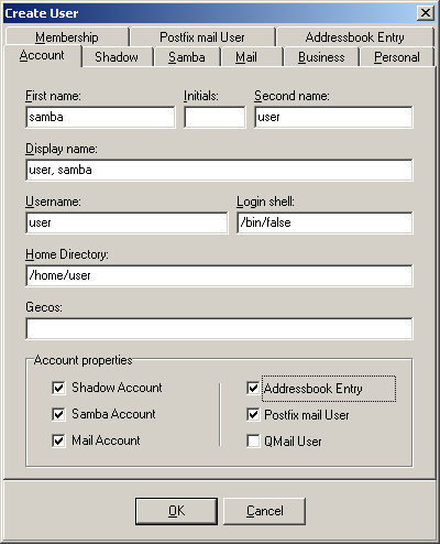
The checkboxes on the right side represent a template option which can be turned on or off, in the same way standard dialog options do.
- Use templates as property objects
This is probably the most interesting and powerful template option. LdapAdmin supports a number of objects which can be created and modified by using the property dialogs. When turned on, this option will allow you to use templates as additional property objects. New menu options will be added allowing you to choose from the templates when creating new objects.
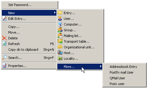
Furthermore, choosing the option Properties... on the selected object from the main or popup menu will search for the matching templates and display all matching templates in a property dialog allowing you to modify the object as you would normally do with any other object directly supported by LdapAdmin.
Template files
LdapAdmin template files are XML based files with ltf extension (*.ltf). They have following format:
<template>
    ...
    <attribute>
        ...
        <control>
            ...
        </control>
        ...
    </attribute>
    ...
    <control>
        ...
        <attribute>
        ...
        </attribute>
        ...
        <control>
            ...
        </control>
    </control>
    ...
</template>
Template body
Template body is defined as follows:
<template>
    <name>          Name of the template   </name>
    <description>   Template description   </description>
    <rdn>           Designated rdn         </rdn>
    <extends>       Dialog name            </extends>
    <icon>          Icon bitmap            </icon>
    <script>        Script declaration     </script>

    <attribute ... >
        ...
    </attribute>
        ...
    <control ... >
        ...
    </control>
        ...
</template>
- name
- Defines template name as it occurs in the template list. This directive is required.
- description
- Additional descriptive information of the template. Optional.
- rdn
- Represents designated RDN (relative distinguished name). This argument has effect only when new entry is created using the template. It represents attribute name which will be used to automatically form entry's DN as soon as designated attribute receives the value.
For example, if designated RDN has a value of cn then, as soon as cn value is determined the RDN of new entry takes the value
of cn=<value> thus automatically giving a value to the DN of the entry. Optional.
- extends
- This directive defines a dialog name which can be extended with this template. If the general options allow it, the template will be embedded in the existing dialog. Currently, user and group dialog support extending. This argument is optional.
- icon
- You can define icon for this template to be displayed in menus and toolbars. It must be a windows bitmap file and should have a dimensions of 16x16, if it doesn't it will be automatically resized to fit this size.
<icon>
    <file>               Path to bitmap file                         </file>
    <bitmap>             base64 coded bitmap data                    </bitmap>
    <transparentcolor>   Color of transparent pixels, hex or decimal </transparentcolor>
</icon>
- You can either define path to a file containing bitmap data using <file> tag or include base64 coded bitmap directly within <bitmap> tag. Bitmap tag is preffered over file tag so if both tags are defined the bitmap tag will be used. To define transparent color use <transparentcolor> tag. You can use decimal or hexadecimal notation. Hexadecimal notation must be prefixed with a $ sign, e.g. $FF00FF00.
- script
- The embedded script or reference to external file containing Javascript or VBScript code, evaluated upon template execution. See here for more informations about the template scripting support.
- attribute
- Attributes are one of two basic building blocks of LdapAdmin templates (the other are controls which are explained next). Attributes are elements which are used do describe data. One template attribute defines data belonging to corresponding LDAP attribute identified by its attribute name. In LdapAdmin templates controls are attached to data, therefore one attribute can contain one or more controls which manipulate its data but it can never contain another attibute. In other words, you can define controls within attribute body but it is illegal to define attribute within body of another attribute. If you do not define any controls within attribute body, default control will be automatically created for the attribute if attribute type was defined. You should always define attribute type unless you intentionally want attribute to be hidden, i.e. not to have a visible control attached to it. You would generaly do so with objectclasses or some other attributes which are directly mapped to another attribute by the means of parameters and should not be changed by user (such as when cn maps to uid litteraly).
- control
- Whereas attributes define data, controls define elements used to manipulate this data. To attach control to data, simply define it within the attribute body. During runtime, the control is displayed and changes are reflected in the values of attribute the control was attached to. However, you can also define controls outside the attribute. Such controls are not attached to any data and manipulating them would have no effect on LDAP directory. So why should we define controls which do not affect data? Well, you can define controls such as panels, groups and simmilar to place other controls on them and optimize your template layout. While it is illegal for an attribute to include other attributes within its body, for controls it is not. A control can contain other controls or attributes, thus making it possible to create complex layouts with nested controls. There is virtualy no limit (well, there is but you'll never hit that) to number of such nested controls.
Attributes
Within the template body attributes are defined using the following syntax:
<attribute type="...">
    <name>            Attribute name            </name>
    <description>     Descriptive information   </description>
    <value>           Default value             </value>

    <control ... >
        ...
    </control>
</attribute>
- type
- This argument defines attribute type. It is optional, and you can omitt it to hide attribute by preventing it from getting a default control. The supported attribute types are:
| text |
Plain text |
| datetime |
Date and time. Defaults to LDAP Generalized Time format as defined by 1.3.6.1.4.1.1466.115.121.1.24 |
date |
Date, defaults to local date |
time |
Time, defaults to local time |
| jpeg |
JPEG picture, base64 coded |
| boolean |
Boolean, defaults to boolean as defined by 1.3.6.1.4.1.1466.115.121.1.7 |
| binary |
Binary data |
| number |
Decimal number |
| integer |
Integer number |
- name
- Defines attribute name as it occurs in LDAP. This directive is required.
- description
-
- Additional descriptive information of the template. Optional.
- value
- Default attribute value. This directive is optional but if it is present then this value will be assigned to the attribute if no such value already exists (for example when modifying LDAP entry, the existing value will not be changed). Multiple default values are allowed if the attribute can support them and proper control is chosen. This directive can take parameters which makes it possible to combine other attribute values to create new default value. The parameters are attribute names enclosed in percent signs %. For example, if default value for the attribute uid would be defined such as:
%firstName%.%sn%
then, as soon as the values for the attributes firstName and sn are known the LdapAdmin would take those values to form the new default value for the attribute uid.
As long as all parameters don't have value, the whole default value is left empty.
If you need to have % sign in the text use escape character ('\') to indicate this.
Controls
The controls are defined within attribute body and determine the control type which will be used to display and modify the attribute:
<control type=...>
    <name>        Control name               </name>
    <caption>     Label text                 </caption>
    <color>       Background color           </color>
    <fontcolor>   Text color                 </fontcolor>
    <fontstyle>   Font style                 </fontstyle>
    <height>      Control height in pixel    </height>
    <enabled>     Enable/disable the control </enabled>
    <regex>       Regular expression         </regex>
    <event>       Event handler              </event>
    ...
</control>
- name
- Name of the control. This directive is optional, only used in conjunction with chained controls (controls which act on other controls, such as pickupdlg).
- caption
- Control label. Optional, if not defined then the attribute description or attribute name will be used instead. By using the attribute lang you can create a localized captions:
         <column>
            <caption lang="en">Description</caption>
            <caption lang="hr">Opis</caption>
            <value>description</value>
         </column>
- color
- Specifies the background color of the control. A hexadecimal RGB value, i.e. 0xff0000 for red.
- fontcolor
- Specifies the color of the text characters.
- fontstyle
- Specifies the font style. A comma separated list representing a combination of one or more of the following styles: bold, italic, underline or strikeout.
- height
- Specifies the height of the control in pixel.
- enabled
- Can be true or false. If false then the control will be grayed out and user interaction will not be allowed.
- regex
- Regular expression used to validate the content of the control.
<regex>
        <expression>     regular expression to match              </expression>
        <errormessage>   message to display in case of mismatch   </errormessage>
</regex>
- event
- Specifies a Javascript or VBScript event handler. See here for detaileds on scripting support.
Control types
The tag option type determines the control type which will be used. Depending on the control type additional options may be defined.
Currently, following controls are supported:
- button
- This places a standard button on the form which can be used with scripting engine.
- edit
- Standard single line field used for displaying and modifying text contents. Use tag <editmask> to define format of the text field.
- label
- Displays a line of text. The control can display a content of an attribute or a fixed text which can be defined with a <text> tag.
- textarea
- Multiple line field used for displaying and modifying text contents
- combo
- Dropdown list field used to freely modify text content or choose items from the dropdown list.
The items are defined by using the tag <item> placed within the <items> tag body:
<control type="combo">
    <items>
        <item>item1</item>
        <item>item2</item>
    </items>
</control>
- combolist
- Dropdown list field used to choose items from the predefined dropdown list. The list captions and values can be separately defined:
<control type="combolist">
    <items>
        <item>
            <caption> item caption </caption>
            <value> item value </caption>
        </item>
        ...
    </items>
</control>
- combolookuplist
- Dropdown list field used to choose items from the list returned by LDAP search. Required directives <filter> and <base> are used to define LDAP filter and search base for the query. Tag <displayattribute> defines which attribute value will be used as a caption for the items. Tag <valueattribute> represents the result attribute; value of this attribute will be passed to the attribute the combo control belongs to. Both directives are optional and default to dn.
<control type="combolist">
    <filter type=...>   LDAP filter    </filter>
    <base>              base dn        </base>
    <displayattribute>  item caption   </displayattribute>
    <valueattribute>    item value     </valueattribute>
</control>
For a description of the filter directive, see pickupdlg control.
- checkbox
- Three state checkbox control. Use tags <true> and <false> to define values for checked and unchecked state, all other values will be represented with grayed checkbox meaning undefiend state. If you do not define your own values, the default strings "TRUE" and "FALSE" as defined by OID 1.3.6.1.4.1.1466.115.121.1.7 will be used.
- number
- Valiadated text box for entering decimal values.
- integer
- Valiadated text box for entering integer values.
- grid
- String grid used to edit multiple text values, mail addresses for example. Use tag <rows> to set number of grid rows.
- image
- Used to display jpeg images. Currently read only.
- list
- List control used to display multiple text values, mail addresses for example. Mostly, you will use a listbox control which provides a means of manipulating the data as well.
- listbox
- A list control with buttons to allow adding, editing and removing of the list entries. The controls are grouped on a panel control. You can use bevel tag to control the panel appearence.
<control type="listbox">
    <bevel>             panel appearence           </bevel>
    <margin>            margin in pixel            </margin>
    <buttons>           control buttons            </buttons>
</control>
The margin tag represents the number of pixels between the panel border (which in turn can be switched off through the bevel tag) and the controls (list and buttons) within. The buttons tag defines a group of control buttons used to manipulate the list content.
<buttons>
    <orientation>          button orientation         </orientation>
    <alignment>            button alignment           </margin>
    <button type="...">    control button             </button>
    ...
</buttons>
The orientation tag controls the orientation of the button group. The vertical orientation places the buttons along the left or right side of the list, the horisontal orientation places them below the list. The tag aligment controls the placemant of the button group,
on the left or the right side of the list. The button tag defines a button itself and can be repeatably used to place an arbitrary number of buttons on the control. There are four type of predefined buttons which can be used to control the list box:
| add | Provides a dialog to add one line of text to the list |
| edit | Provides a dialog to edit the highlighted line |
| delete | Delete the highlited line from the list |
| browse | Same as pickupdlg except for the datacontrol tag which is automatically set to list box and should not be used. See pickupdlg for a detailed explanation |
The button tag without the type attribute will produce a button without the default action which can be used with scripting.
Note that all elements (panel, list, buttons) are itself template controls which can be controlled with the common control tags. It's perfectly ok to write:
<button>
    <color>0xff0000</color>
    <forecolor>0xffffff</forecolor>
    <caption>This is a RED button. Do not press this button!</caption>
    <event type="OnClick">alert("Warned you...");</event>
</button>
- passwordbutton
- Can be used to set password on arbitrary attributes.
- panel
- Bordered area used to group controls for layout optimizing. The visual appearence can be controled with <bevel> tag. The tag can take following values:
| raised | Raised area, default |
| lowered | Lowered area |
| frame | Single surrounding frame |
| none | No visible distinction |
- tabbedpanel
- Bordered area used for layout otimizing that displays multiple tabs which can host further controls and attributes.
<control type="tabbedpanel">
    <tab>
        <caption> Tab label </captiom>
                ...
    </tab>
    ...
</control>
- date
- Calendar date control with support for different date formats. The formats for display and actual values can be separately definedby using <dateformat>, <timeformat> and <displayformat> tags. Although this control displays and manipulates only date, time format can be set as well. This provides for a possibility to change only date portion of a datetime LDAP field without destroying time portion of it which allows us to combine date and time controls to act on a same actual field. The format strings takes following parameters:
| d | Day of month as digits with no leading zero for single-digit days. |
| dd | Day of month as digits with leading zero for single-digit days. |
| ddd | Day of week as a three-letter abbreviation. |
| dddd | Day of week as its full name. |
| M | Month as digits with no leading zero for single-digit months. |
| MM | Month as digits with leading zero for single-digit months. |
| MMM | Month as a three-letter abbreviation. |
| MMMM | Month as its full name. |
| y | Year as last two digits, but with no leading zero for years less than 10. |
| yy | Year as last two digits, but with leading zero for years less than 10. |
| yyyy | Year represented by full four or five digits, depending on the calendar used. |
| yyyyy | Identical to "yyyy". |
| gg | Period/era string. This element is ignored if the date to be formatted does not have an associated era or period string. |
Following parameters can only be applied to <dateformat> tag:
| gtz | LDAP Generalized Time format as defined by 1.3.6.1.4.1.1466.115.121.1.24. The control will only change date portion of the value field. |
| unix | Datetime in unix format. The control will only change date portion of the value. |
- time
- Time control with support for different time formats. The formats for display and actual values can be separately definedby using <timeformat>, <dateformat> and <displayformat> tags. Analogue with date control, this control will only change the time portion of data allowing it to be combined with date control on the same LDAP value.
| h | Hours with no leading zero for single-digit hours; 12-hour clock. |
| hh | Hours with leading zero for single-digit hours; 12-hour clock. |
| H | Hours with no leading zero for single-digit hours; 24-hour clock. |
| HH | Hours with leading zero for single-digit hours; 24-hour clock. |
| m | Minutes with no leading zero for single-digit minutes. |
| mm | Minutes with leading zero for single-digit minutes. |
| s | Seconds with no leading zero for single-digit seconds. |
| ss | Seconds with leading zero for single-digit seconds. |
| t | One character time marker string, such as A or P. |
| tt | Multicharacter time marker string, such as AM or PM. |
Following parameters can only be applied to <timeformat> tag:
| gtz | LDAP Generalized Time format as defined by 1.3.6.1.4.1.1466.115.121.1.24. The control will only change time portion of the value. |
| unix | Datetime in unix format. The control will only change time portion of the value. |
- datetime
- This control is actually a combination of date and time controls visually grouped and syncronized to act as a single control. The actual date and time controls can be displayed in vertical or horizontal alignment. This can be controlled with the <align> tag. The panel appearence can be controlled with the <bevel> tag (see panel control for parameters).
- pickupdlg
- Powerfull multichoice dialog used to choose entries from the set obtained by LDAP query.
<control type="pickupdlg">
    <datacontrol>       control to pass the values to </datacontrol>
    <filter type=...>   LDAP filter                   </filter>
    <base>              base dn                       </base>
    <returns>           result attribute name         </returns>
    <column>
            <caption> column caption  </caption>
            <value>   attribute name  </value>
    </column>
        ...
</control>
This control is represented with a button launching a dialog that allows you to choose multiple entries from a list view. It does not affect any attribute directly, rather it passes selected values to another control defined by the <datacontrol> tag. Usually, this control will be grid or a list but can be used for any other control as well, such as text area or image. The items in the dialog list are obtained as the result of the LDAP query defined by required <filter> and <base> directives. Filter type can be one of the following:
| users | Display list of all posix users in search path |
| groups | Display list of all posix groups in search path |
| custom | You can define your own search filter within the tag body |
Directive <returns> defines atttribute which values will be passed to the data control.
Directive <column> is used to define the columns which will appear in the list view of the dialog. Tag <caption> defines a column caption and tag <value> is the name of the attribute from which values will be taken for this column. Beside of actual attribute names you can use following pseudo attributes:
| *DN* | Represents entry dn |
| *RDN* | Represents rdn of the entry |
| *PATH* | The path to the object in LDAP tree in canonical format |
|
 News
News